WHAT IS
NextUp?
NextUp is an app to inform people of nearby events that are ongoing or about to start in a simple and fun way that facilitates immediate decision making.


WHO
DO WE DESIGN FOR?

Urbanites
People who live in the city and are looking for something to do on short notice.

Travelers
People new to the city and who are trying to discover some events in a spontaneous way.

WHY
NEXT UP
Spontaneity
Ease
Planning ahead for an event or trip often takes large amount of time and can take away the novelty of the experience.
Yelp and Google map are mostly used in these situations, but there is too much information that might overwhelm the users and the reviews are not that trustworthy for our target users.
Intuitive Selection
It can be hard to make decisions when there are too many options. Our app relies on a process of elimination that facilitates decision making.
DESIGN INSIGHTS
We wanted the app to have as low a cognitive burden on the user as possible so we wanted to minimize the options that are shown to the user at any given time. We decided to restrict events displayed in the app to either ones currently ongoing or that will be happening in no more than 3 hours. It should be a simple, light, and easygoing experience.
1. Start with MOOD FILTER!


"I don’t always want to go to the same type of event. It depends on the mood I’m in."
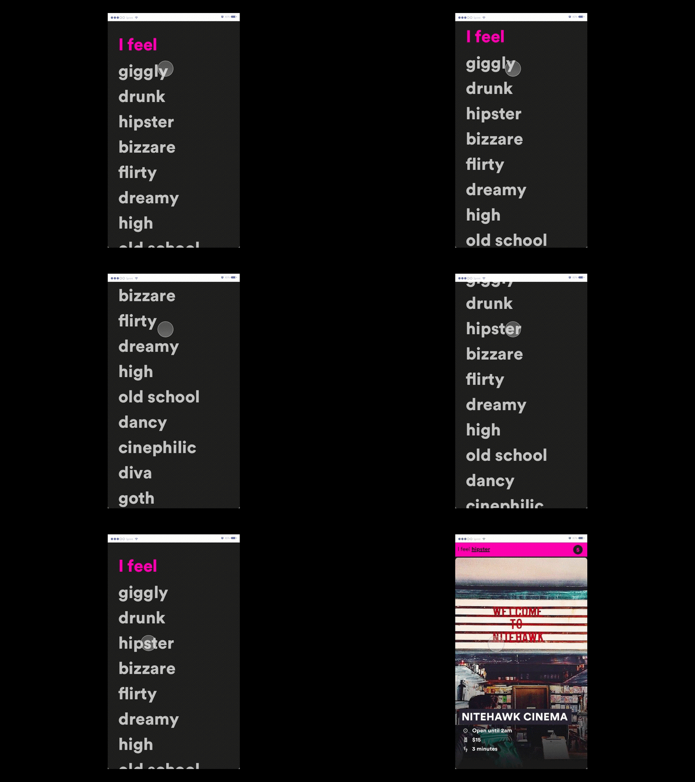
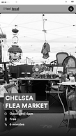
During the onboarding process, users are prompted to select a mood or personality that resonates with what they would like to do at the current moment. There is a day mode and a night mode that provides different moods.
DAY

NIGHT


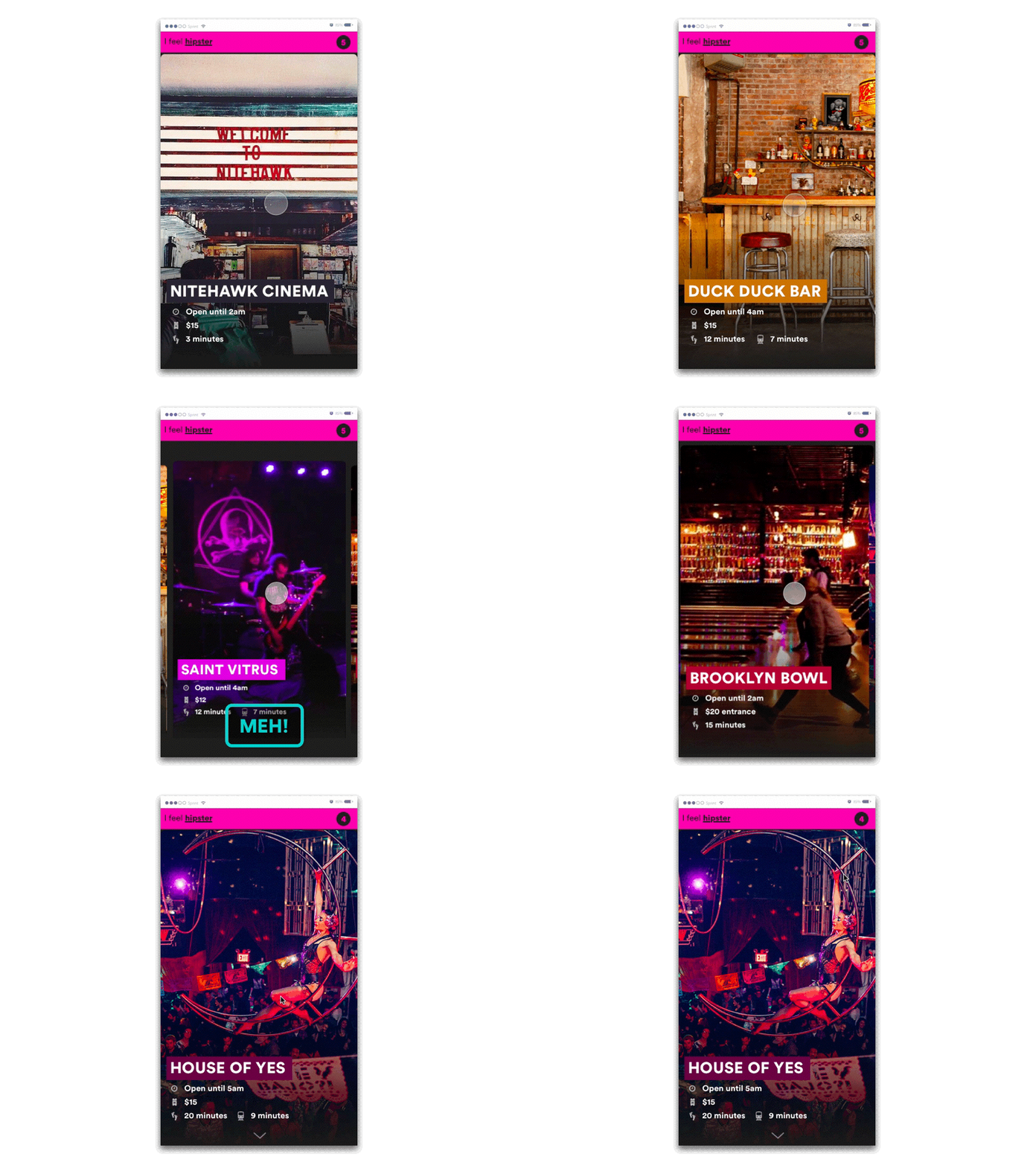
NextUp will then generate a batch of 10 easily accessible options based on GPS location. The events on the carousel screen feature large images with minimal information, such as price and distance for each event. And the events are presented as a loop for user to swipe.
2. See what EVENTS you got


What to show?
As we wanted the experience to be light, simple and efficient, we found other event-related apps and showed them to people to prioritize the four pieces of information they want the most, and then we designed our page based on that.

“Meh” appears on the screen when the users tap the screen, and users can eliminate the events they are not interested in by swiping down. Thus, they will end of with a shorter menu of events from which to choose. This feature facilitates easier decision making.

"It takes time to choose things that I want from the options but it's easier to know what I don't want."

3. Say MEH! to eliminate
there are MORE!
4. No worries,
If the user says meh to their first batch of 10 events, NextUp will check in with the user and provide them with 10 new events to prevent the infinite scrolling and choice overload common other similar apps.


Once the user swipes up on an event they are interested in, they enter the event's detail page where they will find additional information on the event. From this details page users can also access Instagram images from the event and if they are interested in going, the app will bring them directly to the navigation page.

5. TELL ME MORE
SCENARIO
LET'S SEE THE STORY
THE PROCESS

Brainstorming
First, we tried to write down general topics that we might be interested in and voted for the top three. Our three topics of choice were travel, collections, and museums.

Research / Idea developing
Then we started to develop different concepts for the three topics and did the research at the same time to find the potential ideas for the topics.

Decision making
After developing rough ideas, we presented them to other designers for feedback. Eventually, we decided to stick to the topic of travel, which has inspired many designs and is pretty challenging.


In person interviews
We then started interviewing people and dug into the problems they might have with traveling. It was hard to narrow down the concept because there were many travel-related products out there. We categorized and analyzed the problems and figured out the direction.

Interviews
18
37
Survey sample size

Paper Prototype & Flow Testing
Building off this research, we created a quick paper prototype and tested with some people to facilitate our user flow and interactive experience. We made sure the ideas were as simple as possible but understandable.
Interface Mockup &
Micro Animation Testing
To understanding more users' needs and reaction, we made several mockups and prototypes testing the interactions and micro animations. We kept iterating the design and eventually came up with this final product.


Version 2
Version 1
Current